The Best Worst Graph
Junk Charts is a great blog that breaks down graphs that appear in literature and the media. Inspired by Kaiser Fung, I keep an eye out for WHS related graphs, and I think I’ve found the best worst graph in WHS history.
Normally a bad graph really makes you work to understand it. At first it makes no sense, and only after teasing it out do you get what the data is, and what the message is meant to be. Things like poor labelling, strange colour choices, funky axes, irrelevant data etc are typical issues.
What makes this infographic/graph explaining ALARP (as low as reasonable practical) so fantastic is that it manages to do the opposite: at first glance it makes sense! And then progressively makes less and less sense the more you look at it.
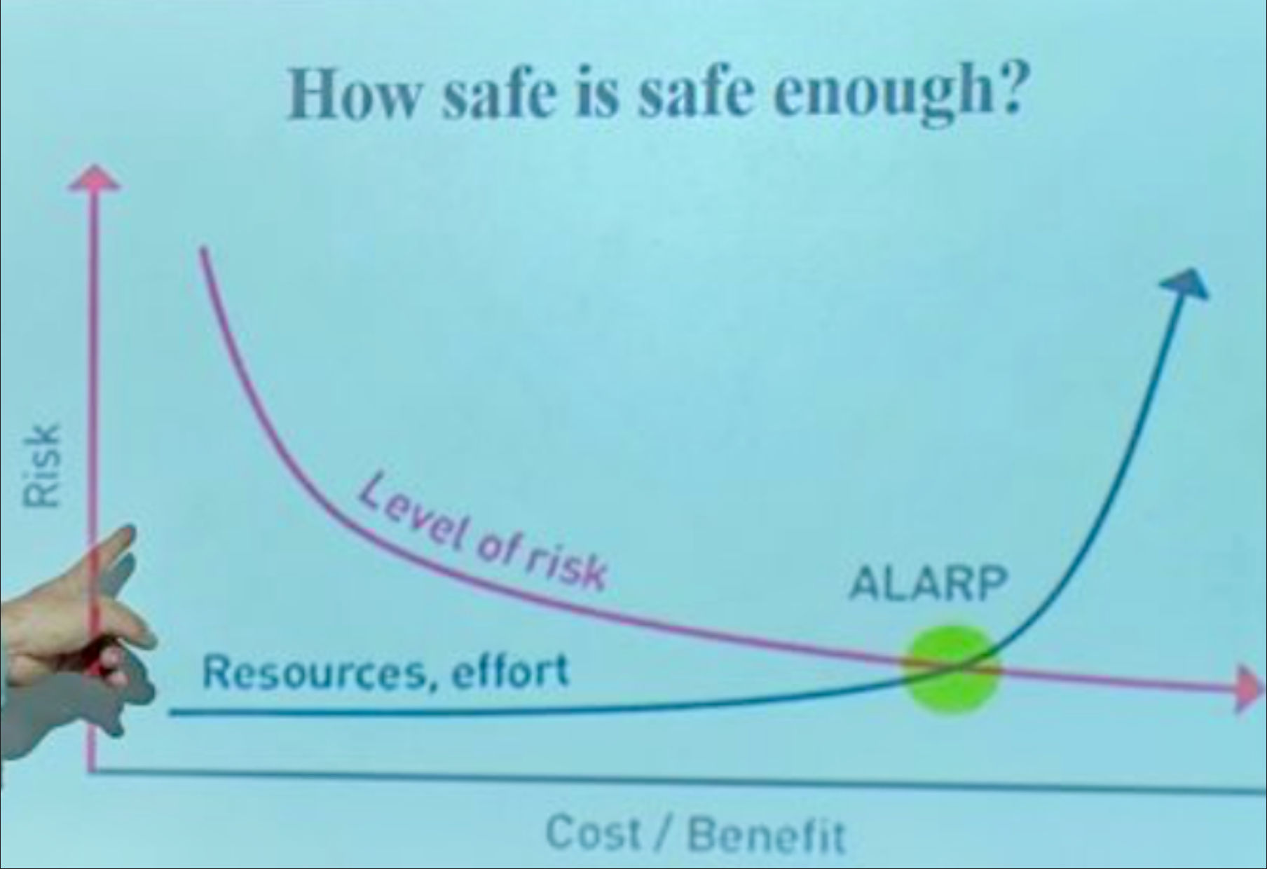
Image taken from LinkedIn - Reference not given to avoid putting anyone on blast.
So, if you haven't already, have a quick look at the graph and see what your immediate lizard brain reaction is to its potential meaning. If you're like me, you might have thought that it’s saying: ALARP is the intersection between the level of risk present and the costs required to rectify that risk. The higher the risk, the higher the expectation is to spend money. This seems fairly reasonable, though I'm sure a risk expert might tell us that it's slightly more nuanced than that.
Now let’s take a slightly closer look. I like to start with the axes.
The y-axis is easy, so we start there. Presumably, up means more risk, down means less risk. Given the context I would guess this would be interpreted “inherent risk (before an intervention)”.
The X-axis is labeled “cost / benefit”. Without any units, we are left to guess whether it means “cost slash benefits” as in cost and benefits are the same thing, or “cost divided by benefits” as a cost/benefit ratio and it’s meant to be related as the efficiency of spending. Either way it seems confusing as cost and benefits are not the same - $x spent could achieve a lot, or a little. On the other hand, the cost-benefit ratio would suggest that determining what is safe enough relates to how effectively you spend money, not the size of the investment. If the risk is low, you should waste money, and if the risk is high, be very mindful with how you spend money. Given the context I’m going to call this “the amount of money expected to be invested”.
Let’s look at the axes holistically. The convention is to put the independent variable on X, and the dependent on Y. In this case we can read the axes together as “as the amount of money expected to be invested on controls changes, the pre-control inherent risk changes”. That doesn’t seem right to me causally. So unless time flows in more than one direction, I think we’ve got this backwards.
Finally, let’s look at the data on the chart, of which we have three. The “level of risk” line, the “resources and effort” line and their intersect labelled “ALARP”. Taking them one at a time, I would interpret these to mean:
As cost/benefit increases, the risk of “the level of risk” decreases.
As the cost/benefit increases, the risk of “resources, effort” increases.
Therefore: ALARP is when the cost/benefit at which the risk of “the level of risk” matches the risk of “resources, effort”.
So, ‘how safe is safe enough?’. I’m not too sure.
My basic understanding of ALARP is that it is related to the point at which the cost of a particular control became grossly disproportionate to the risk being managed, and therefore claiming it is impractical is defensible. Though I’m happy to be corrected. If true, however, even with a charitable reading I’m not sure this graph conveys the meaning it intends to.
I would love to see any graphs you have found in WHS or occupational hygiene - whether particularly good or bad!